Museum-grade quality prints Worldwide shipping Largest video game art selection in the world Lifetime guarantee on prints
30 Years of Sonic the Hedgehog

article

30 Years of Sonic the Hedgehog

How Sega Moved Sonic from 2D to 3D

Arjan Terpstra

08 Apr 2021 ⋅ 10 min read

This year marks the thirtieth anniversary of Sonic the Hedgehog. Launched June 1991, the blue blur raced to video game stardom, finding fans all over the world who deeply love the cheeky hedgehog and his iconic band of friends and frenemies.

As is the case with every pop culture icon, a successful 30-year run is not something that is achieved easily. As we explain in our encyclopaedic Sonic the Hedgehog art and design book, both the characters and the lineup of games need tons of maintenance, involving thousands of tiny design decisions.

One major leap for Sonic as a games series and a franchise, was the move from 2D to 3D. The technical capabilities of SEGA's Dreamcast console held great promise for 3D video games, but this meant Sonic had to leave his comfortable, pixelated 2D platform world for something else too…

In honor of Sonic's 30th, we present a large excerpt from our Sonic book below, showing how SEGA and Sonic Team dealt with the challenge. Enjoy!


How SEGA moved Sonic from 2D to 3D


For its new console, Sega decided on a different route. The Dreamcast relied on components that had already found use in personal computers and could be bought ‘off the shelf’, without added development costs or use of exclusive licenses. This approach was reflected in stores: in September 1999, almost a year after its Japanese debut, the Dreamcast launched in the States for $199, half the price of the Saturn.

Sonic Team began work on what would become Sonic Adventure with the Dreamcast’s specifications in mind. Development of the game kicked off with its director Takashi Iizuka exploring new game ideas with Yuji Naka. To them, 3D gaming gave room to the gaming character, in a literal sense. Two-dimensional side views had restricted Sonic to narrow paths that he could not stray from, while 3D allowed him to roam freely. What if Sonic would leave the platform genre, and find himself in a role-playing game?
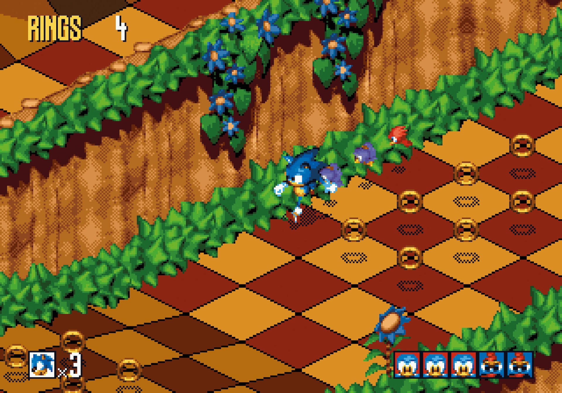
Sonic 3D screenshot
© SEGA

Before Sonic Adventure, Sonic 3D Blast (1996) experimented with an isometric perspective and pre-rendered 3D models converted to (2D) sprites.

“Around this time, the company was kicking off with the Dreamcast,” Iizuka remembers. “There was this brand new piece of hardware that had visuals that nobody had used in a video game before. To us, this posed an opportunity to explore new things: we felt we had the hardware we could challenge ourselves with in this undertaking of recreating Sonic, the character, and his world brand new. To us, it was the perfect timing. Sonic Team wanted to make this new, edgy, more Western character design work, and found an opportunity in the new hardware, so it all kind of culminated in Sonic Adventure and the modernization of Sonic.”

The team was up to the challenge, having spent a couple of years understanding the new tech in play. The transition from 2D to 3D meant their knowledge of game development was challenged, as computer hard- and software, game development software, and the skills and knowledge of staff members were all subject to rapid changes. The four years separating the releases of the 2D Sonic & Knuckles and 3D Sonic Adventure, by necessity, were spent experimenting with new technologies, trying out one thing or the next, to surprising and sometimes frustrating results.

Elegance


Eventually, Sonic Adventure would be one of the best and most innovative games created by Sonic Team. Not only did it introduce radically new gameplay and new playable characters, it also pioneered a new art direction that portrayed Sonic in a different light than before. The cool attitude was still there, the bad boy exclamations and rock music sound track that expressed Sonic’s rebellious side; but the character had found a new and rather striking elegance, too. His body was much taller than before, with long arms and legs better expressing his moods. Sonic impatiently tapping his foot — an idle animation seen when players stalled the 16-bit games for a bit too long — had been a series standard from the first title onward; but now his range of bodily expressions was greatly expanded.

A new lead character designer, Yuji Uekawa, was responsible for the change in Sonic’s expression and articulation. “We became free from the small dot art expression [with pixels] we were used to,” he said. “Suddenly, we were able to have Sonic take dynamic action poses freely.”
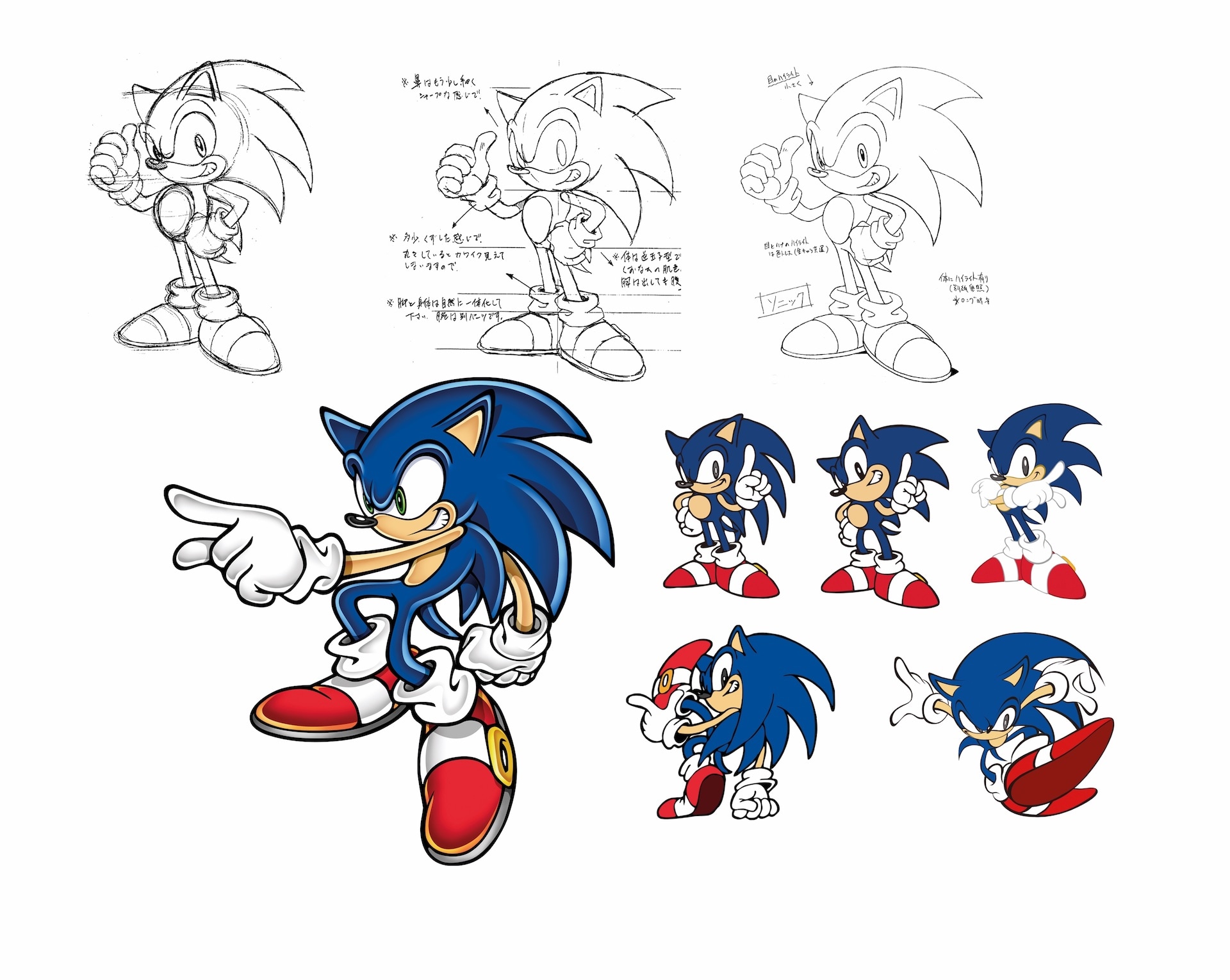
Sonic Adventure sketches
© SEGA

Sonic's new visual style (by the hand of artist Yuji Uekawa) introduced a new dynamism very much in tune with the Sonic Adventure gameplay.

A graphic design major and illustration student before he joined Sega, Uekawa would be a major influence in Sonic’s new look. Citing various inspirational artists — Akira Toriyama’s style of deformation and line art style, and Susumu Matsushita’s airbrush art, but also Disney and Looney Tunes cartoon designs — Uekawa invented a style for Sonic that readied him for the 21st Century, and remains in use today. This was a more agile Sonic than before: less round and cute, one that seemed more of a renegade than the classic character ever was. His quills grew proportionally and became more dominant, almost matching the length of his limbs, adding a set of dynamic vectors to any pose of the character. Also, Sonic suddenly had green eyes, lost his potbelly — loved by many — and was colored a harder blue than before. What had happened?

Modern Sonic


“A lot of things happened at once when we started work on Adventure,” remembers Kazuyuki Hoshino, Sonic Team’s art director and character designer on many Sonic games. To his mind, the newly styled Sonic — commonly referred to as ‘modern Sonic’ in contrast to the ‘classic Sonic’ designs — was born from necessity, after the move from 2D to 3D.

“For instance, the third-person camera would follow Sonic from behind and from a certain height, to give the player an idea of the area in front of him,” Hoshino continues. “But when we used our existing character models, which were very short in size, Sonic’s head suddenly looked so big you did not really see anything below. His body was obscured, and you could hardly see his arms and feet. To us it was clear we needed to change Sonic’s basic design, make him taller, change his head-to-body proportions.”

Other things became clear, too. With 2D pixels, and with a character animation seen from the side, there had never been a necessity to draw details like the undersides of Sonic’s shoes. With 3D, you could see much more of the character than before, so Sonic Team needed to fill in things that had been left to players’ imaginations in the 2D days.
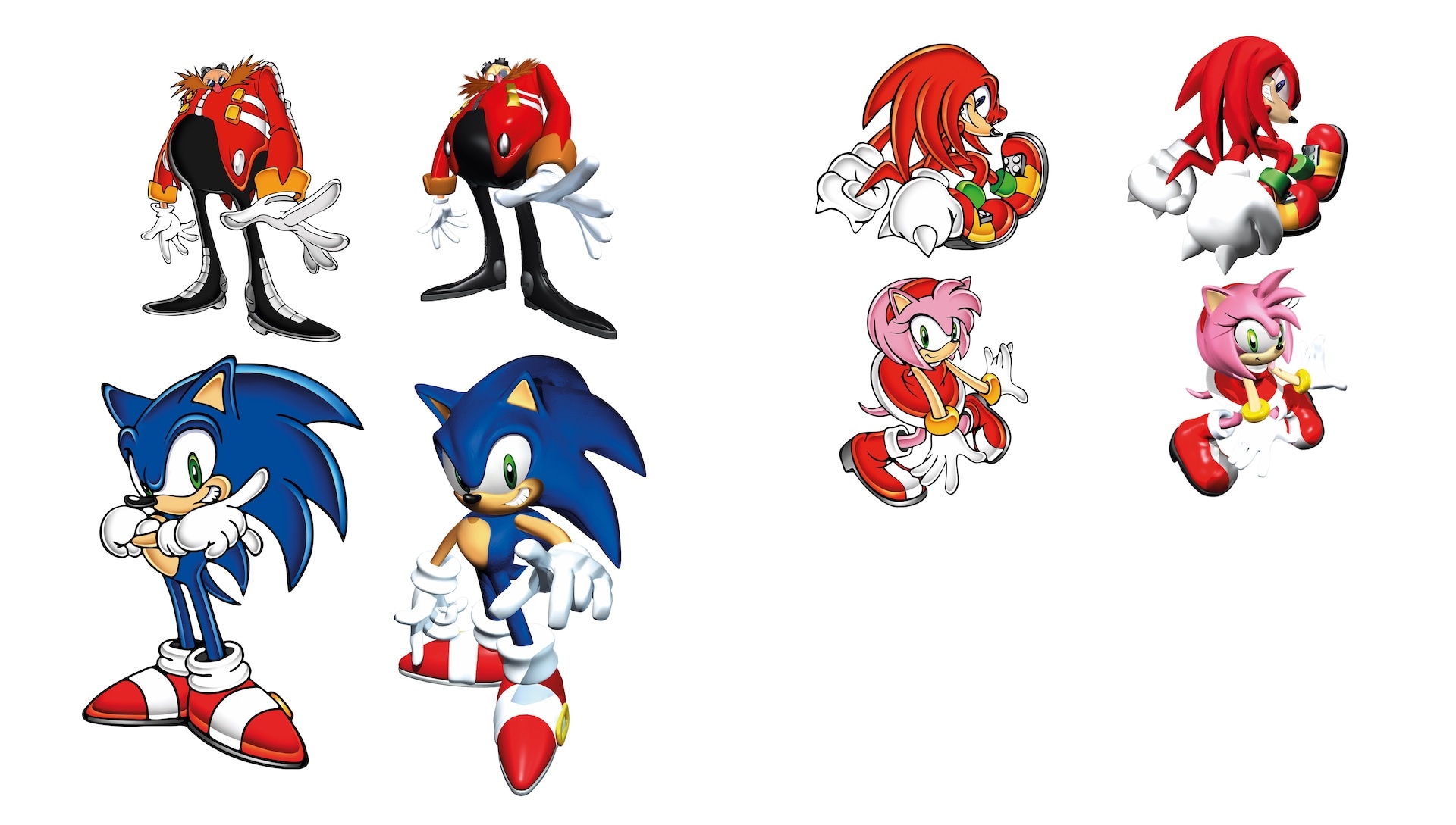
Sonic Adventure art
© SEGA

Side-by-side comparisons of character concept art and in-game renders for Sonic Adventure.

Designing a Sonic that answered the many challenges was left to Uekawa. He kicked things off with examining what made the classic Sonic design great. “His iconic image, I reasoned, mainly stems from the unique eye shape, and the strong impression of his big quills: they make Sonic recognizable just by his silhouette, even when in motion. So, for the new illustration style, I prioritized the lines of the quills, always showing their beautiful curve, independent of Sonic’s posture. To further express his dynamism and strength, I used a calligraphic ‘line’ expression you see in a lot of comics. This may well be the reason why to many people Sonic looks ‘graphical’, ‘graffiti’, or ‘street styled’.”

Uekawa’s designs went back and forth with the rest of the team, until everyone approved of the new art direction. “Uekawa-san’s final designs convinced us, yes, this is it,” Hoshino says. “Next, he changed the other characters in the Sonic universe to fit the same design sense and style. Once the basic design was locked in, there were no problems for us adjusting the other characters.”
Sonic Adventure advertisement (deta
© SEGA

The new Sonic design for Sonic Adventure was teased with this tantalising image, introducing nothing more than Sonic's green pupils.

Uekawa remembers the process as a ‘refining’ of Sonic, in which the character evolved to go with the times. Sonic now had irises around his pupils instead of the basic black dots he sported as a 2D character. Uekawa made them green to contrast with the other colors on his body and clothes, and also “because he is always seeing these green pastures around him, like in Green Hill Zone. I thought it would be nice to reflect that in his eyes.”

As a finishing touch, the color of the modernized Sonic changed to a deeper blue “Although his age didn’t change, his proportions were improved upon, to the effect that a more grown-up Sonic emerged,” Uekawa explains. “His previous light blue color did not match with the new image, so I changed it to a more mature navy blue. Importantly, when confirming the new degree of blue, I considered the color of a new overseas [Sega of America] logo, too. Sonic’s skin color parts were adjusted too, by the way, to keep the overall color balance.”

Marketing


Artistic considerations were not the whole story behind the redesign. Sonic Team soaked up everything that went on around them, which was a lot when development of Sonic Adventure started in 1997. Sega’s marketers informed Sonic Team of new fashion and merchandise trends they wanted to target, and indicated they were looking for something that was more ‘mature’ compared to how classic Sonic was perceived — although the Sonic games had been positioned as a more mature alternative to Nintendo’s Mario series, Sonic as a character was very popular with children.

Also, there was a growing unease at Sega about Sonic being perceived as a ‘Japanese’ character. Although none of the Japanese members of Sonic Team ever expressed concerns about this, there was a general feeling the mascot could perhaps benefit from a more ‘American’, more ‘Western’ design — a distinction that is “kinda hard to explain,” Uekawa admits, but nevertheless is there.

“When you print a cute, Japanese-styled character like (the robotic anime cat) Doraemon on a T-shirt, it will look very childish, and most adults won’t wear it,” Uekawa explains. “But a Western cartoon character like Mickey Mouse doesn’t look unnatural on an adult’s shirt. What we tried to do is to lean the Sonic character design towards a Western ‘design art’ style, rather than the typical ‘cute’ or ‘kawaii’ style that is more Japanese, to aim for a more adult and cool ‘American’ style of expression, to enhance his international appeal.”
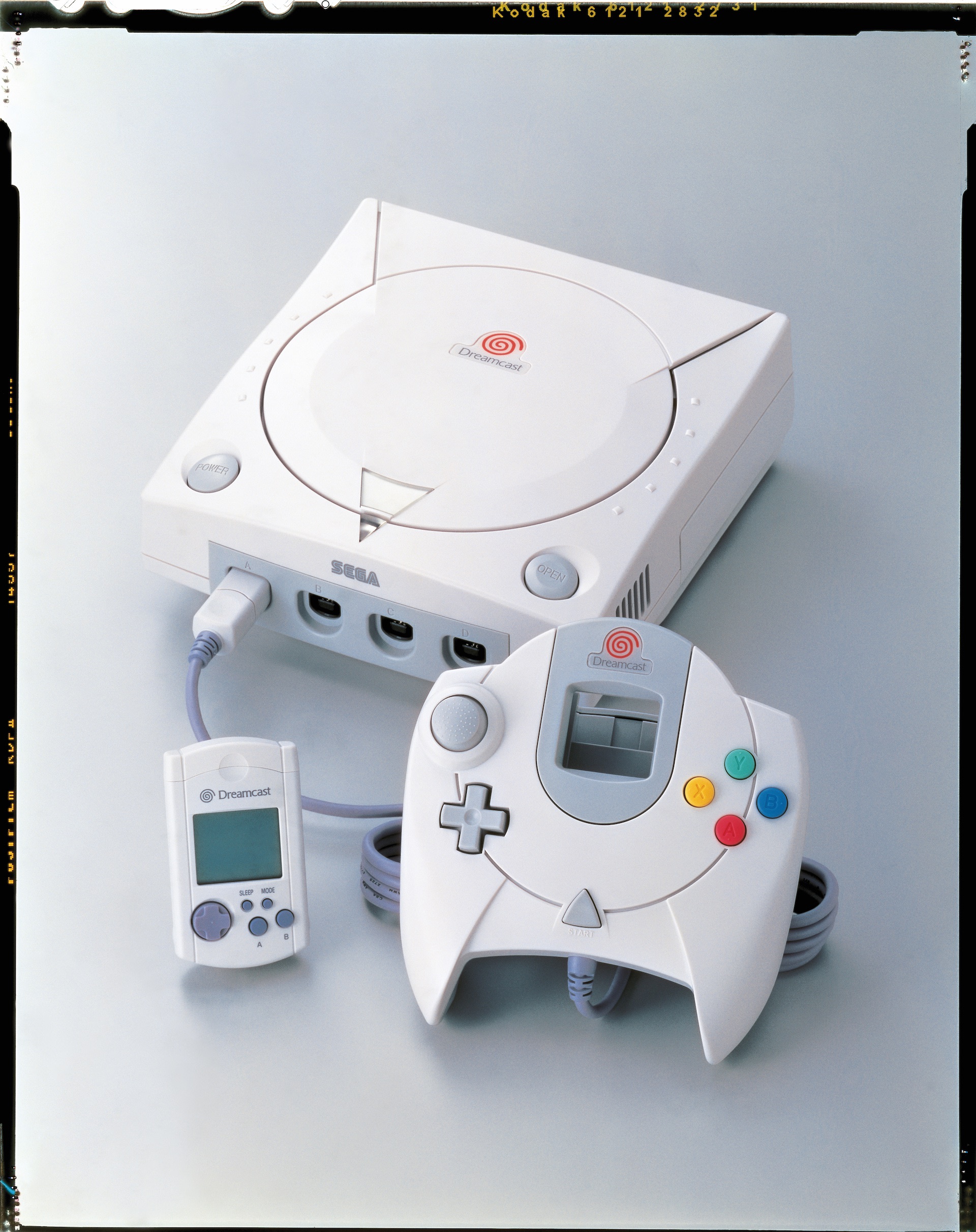
Dreamcast
© SEGA

SEGA's Dreamcast console. More than 9 million were sold worldwide, with Sonic Adventure its flagship title.

Sonic’s modernization involved more than a new character design, though. “Of course we had a real change in Sonic’s proportion and the look and feel of the character,” Hoshino said. “But when you get into questions like ‘what is modern Sonic’, I have to add we really looked into who he is, too. Sure, we know what he looks like, but what is he about? How did he get where he is? Who are his friends? And those answers came through the world building in Sonic Adventure and Sonic Adventure 2. They did a terrific job in reigniting Sonic’s back-story, and his universe. To me, ‘modern Sonic’ starts with that graffiti-style look, but the Sonic we know today is shaped through the video games, and the story-telling in the levels, since that design.”

Want to read more? The encyclopaedic Sonic the Hedgehog art and design book has the full story on Sonic's 30-year adventure in video games. Available from our shop, shipping worldwide!

Sonic The Hedgehog Art & Merchandise

Gotta go fast