Museum-grade quality prints Worldwide shipping Largest video game art selection in the world Lifetime guarantee on prints
The best in video game box art

article

The best in video game box art

Seven artistic moments that changed the face of video games.

Arjan Terpstra

04 Mar 2022 â‹… 9 min read

Back when video games weren't downloaded, box art was pivotal to a game's success. Not only did it draw attention to a game on a store shelf, it also sold you on the adventure burned on the cartridge or disk you eyed in the store. Especially in the halcyon days of early home computing, when the game screen showed you not much more than a few colored blocks, the box art ignited your imagination well before the actual game booted up.

Over time, box art (or cover art) became a design language in itself, with a grammar borrowed from music album covers, book jackets, movie posters and other graphic design formats. The quest to communicate a game to an audience resulted in an art form that (quite literally) changed the face of video games, and that was something much more than mere packaging.

The best box art, in our opinion, is just that: art. Below, we celebrate seven pivotal moments that changed box art forever.
Atari1

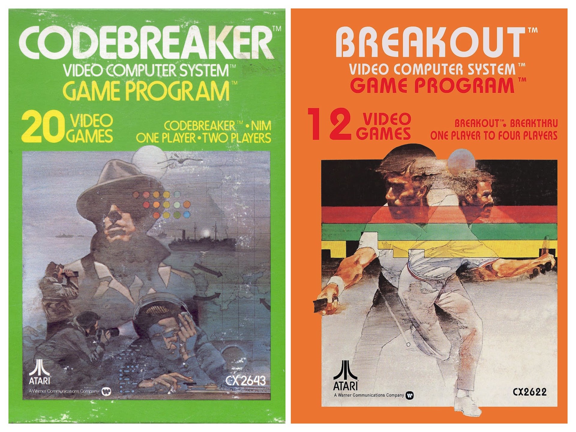
Two boxes for Atari 2600 games, Codebreaker and Breakout.

1. "Atari style" box art


George Opperman, Atari's first in-house graphic artist and designer of the famous Atari "Fuji" logo, knew what needed to be done to sell people on Atari's home console games in the early '80s. His team of highly prolific artists should be seen as "visual salesmen," he explained to Atari's in-house newsletter in 1981. "We collectively try to interpret both the quality and play value of every Atari game. Above all, graphics must attract the players and help them feel that every Atari game is an adventure."

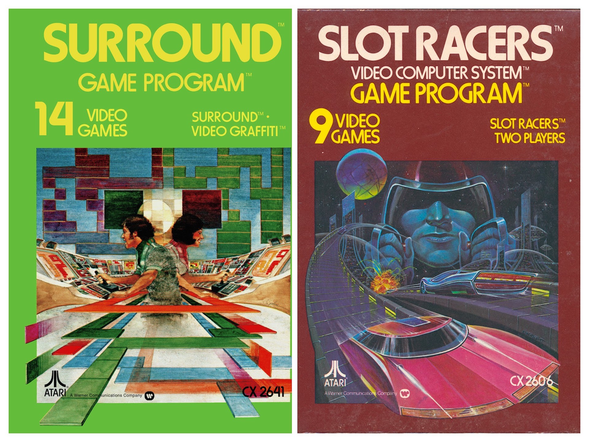
Opperman's team, which included top artists like Cliff Spohn, Rick Guidice, Susan Jaekel, Steve Hendricks, Hiro Kimura, and many more, delivered many classic box designs that still stand out today: monochrome, colored boxes with the 'game program' information written on it in the famous "Atari font", framing one central full-color image where an artist honed in on the game's theme.

This central image often was a miracle of the imagination, selling you the action of the game in dynamic, expressive art. Often the artists relied on acrylics and gouache techniques for their drawings, yielding timeless classics like Steeplechase, Codebreaker or Breakout (all for the Atari 2600), while resorting to other techniques as well, like using an airbrush combined with pen and ink (Adventure, with art by Susan Jaekel).
Atari2

The Slot Racers and Surround "game programs" show the great stylistic diversity that came with Atari packaging art.

2. Roger Dean's work for Psygnosis


"I thought it was important to have something both aspirational and inspirational—literally the shape of things to come" for video game box art, Roger Dean is quoted as saying. The British artist, known for his fantasy landscapes, already made a name for himself when Liverpool studio Psygnosis knocked on his door in the mid-1980s. Dean had designed music album covers for British rock bands Yes and Asia, applying a Salvator Dalí-like mixture of trippy sci-fi and colorful romanticism to album art, and Psygnosis wanted the same for boxed video game art.

Dean delivered, building a portfolio of game art you'd simply like on your wall. In titles like Brataccas (1985), Terrorpods (1987) and Obliterator (1988) he took the game concepts to heart and created highly imaginative takes on the subject matter, that made players' fantasies soar as the image suggested a universe that somehow extended far beyond the borders of the image Psygnosis glued to a Commodore Amiga or Amstrad CPC cartridge box.
RogerDean

Roger Dean's cover designs for Terrorpods and Obliterator. The way the Terrorpod cuts off at the borders of the image, combined with the background skies and birds circling the creature's head, are suggestive of its immense size, as well as the size of the game.

3. Amano's FINAL FANTASY box covers


Psygnosis' efforts to utilize "real art" for games was mirrored in Japan, when game publisher Square (today called Square Enix) asked independent artist Yoshitaka Amano to help out with a new fantasy title. FINAL FANTASY's game director Hironobu Sakaguchi was looking for an artist to bring his vision of a vibrant fantasy world to life, and found Amano (read our full profile here) on the strength of his manga and magazine cover designs.

Thus started a collaboration that would last decades, in which Amano redefined what "video game art" could mean, both inside and outside of a video game. His concept work for the monster and character designs are incredible artistic statements, showing amazing mastery of a wide variety of techniques: woodcut printing, etching, black ink washing, watercolors or charcoal were all applied, often on the same design, and always to a mesmerizing effect.

Amano's role extended to designing the box art for FINAL FANTASY (1987), for the Famicom system in Japan (see below). Western audiences had to make do with (very unartistic-looking) Westernized designs for the same game and would only find Amano's stunning designs on their store shelves when FINAL FANTASY. Origins (2002) came out, as Amano's beautiful work was long deemed too eccentric for this audience.
FinalFantasyBox
© Square Enix/Yoshitaka Amano

4. Greg Wray's Sonic the Hedgehog's box designs


Communication, that was all SEGA of America was worried about, when its CEO Tom Kalinske started his big marketing fight with Nintendo, in 1991. Nintendo was the absolute market leader in games, dominating entertainment shelf space in the US with their NES and SNES consoles and Super Mario games, with SEGA lagging far behind, hoping to one day be a contender to the throne.

Kalinske had rescued Barbie from commercial doom when he worked at Mattel, and knew he needed a big gun to start the fight. Visiting SEGA of Japan, he had learned of a new game around a hedgehog named Sonic, a character that could work as a mascot, in the same way Mario worked for Nintendo. Could this Sonic be the face of the new SEGA, an icon capable of selling SEGA's new 16-bit console, the SEGA Genesis/Mega Drive?

Initially, no. As detailed in the Sonic the Hedgehog art and design book, the Japanese designers had drummed up a typical manga character, with soft and rounded features, and with large eyes and head. They also came up with a backstory that, in Kalinske's eyes, only made sense when you were Japanese, to put it mildly: Sonic was the leader of a rock band, who was on a quest to save his girlfriend, Madonna—at that point in time the number one female musician in the world.
SonicUSboxart
© SEGA

Greg Wray's Sonic design featured "shark-fins" for quills, more pointy and expressive than the ones adorning the Japanese and European Sonic designs. Other differences include Sonic's glance (more mischievous), and more shadows on his body overall, to give him a slightly less adorable sheen. Read more in our Sonic the Hedgehog Art and Design book.

The story would never float with US audiences, Kalinske knew, and the fiercely emancipated Madonna would never agree to be the damsel-in-distress face of the game, so he ordered his marketing team to come up with a new backstory, and engaged artist Greg Wray to spice up the cover design for the US version of the first Sonic the Hedgehog game.

Wray was known as a top illustrator, working for Disney and Warner on their iconic character designs, and he tweaked Sonic to Kalinske's satisfaction: a design that was more angular and edgy than the Sonic on the Japanese and European editions of the same game. Sonic's quills were sharper, his pose less friendly, his blue skin a shade darker and the look on his face more mischievous. Kalinske had his weapon, igniting a marketing war with Nintendo that would define a generation of games and gamers.

5. The Designers Republic WipeOut box art


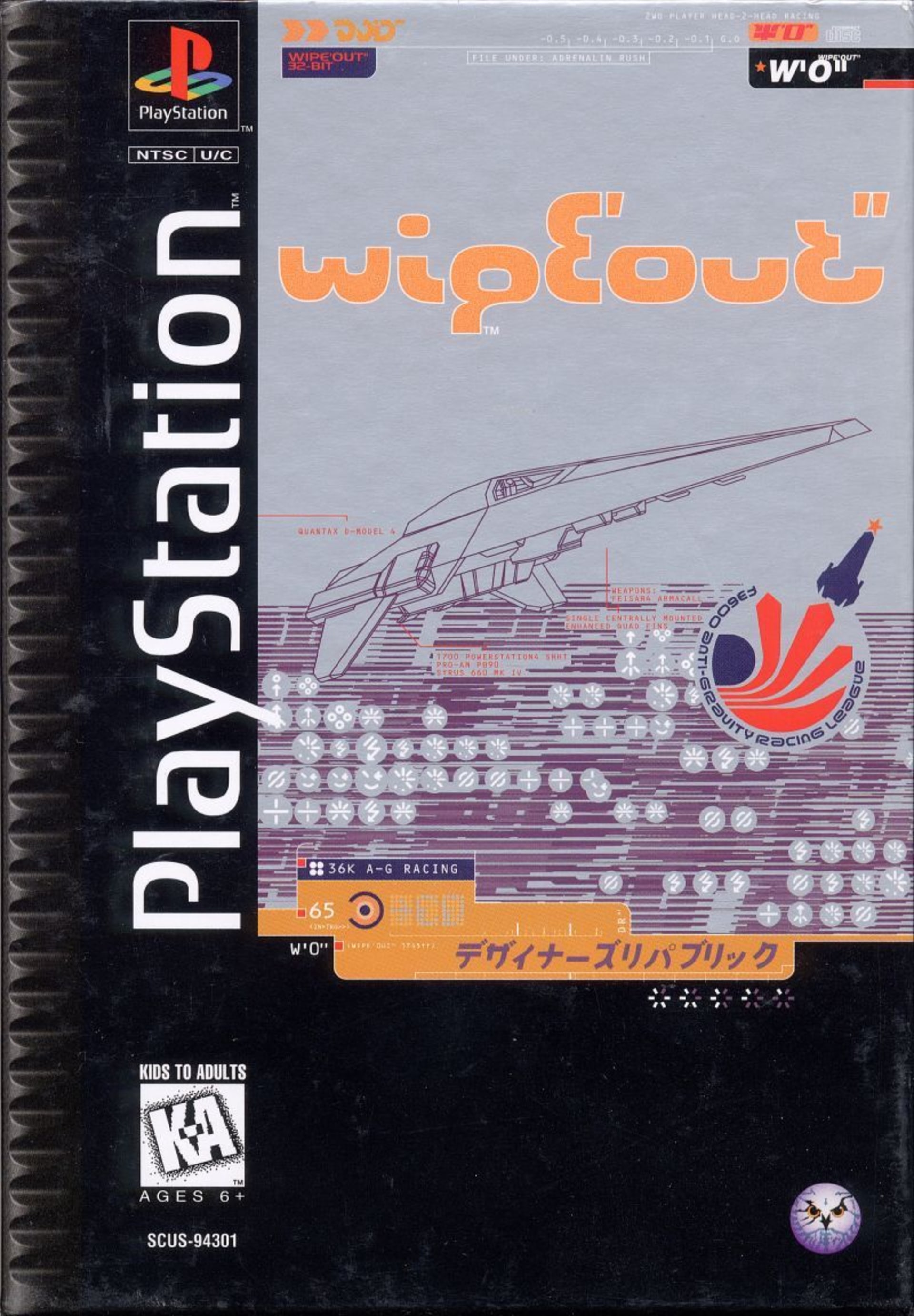
After working with Roger Dean in the eighties, Psygnosis engaged another prolific designer in the nineties. The Designers Republic (TDR) was a design studio from Sheffield (UK) based around founder Ian Anderson, who made a name for himself designing flyers and sleeve art for local bands before he exploded onto the larger design world and worked for brands like Coca-Cola.

The Psygnosis title TDR got to work on was WipeOut (1995), one of the games that would be responsible for the success of the first PlayStation console (launched in 1994). The game, all about speeding through futuristic cityscapes, needed a distinct visual style that communicated the game content, and also the idea you held PlayStation's future of gaming in your hands—superb graphics, fast rendering, and more action than you could handle.

TDR found the visual identity for the game in the box art. They chose a graphic style that combined futuristic elements, blueprint schematics, minimal color and bold Japanese katakana characters to introduce us to the future of computer racing, leading to art that is favored by video game collectors worldwide.
WipeOut

6. Yoji Shinkawa's Metal Gear Solid box art


The "Amano moment" that happened at Square was repeated in 1994 when Konami hired a promising young artist straight out of art school: Yoji Shinkawa (read our full profile of the artist). Teamed up with famed game director Hideo Kojima to work on the first 3D game in the Metal Gear game series, Shinkawa impressed by delivering on all aspects of video game art development. Not only did he sketch outstanding character and environmental designs the team could use for 3D modeling, he also built physical models for the in-game mecha and vehicles, notably the Metal Gear REX, that he hand-crafted in his tiny apartment as a real-world study for the digital model.

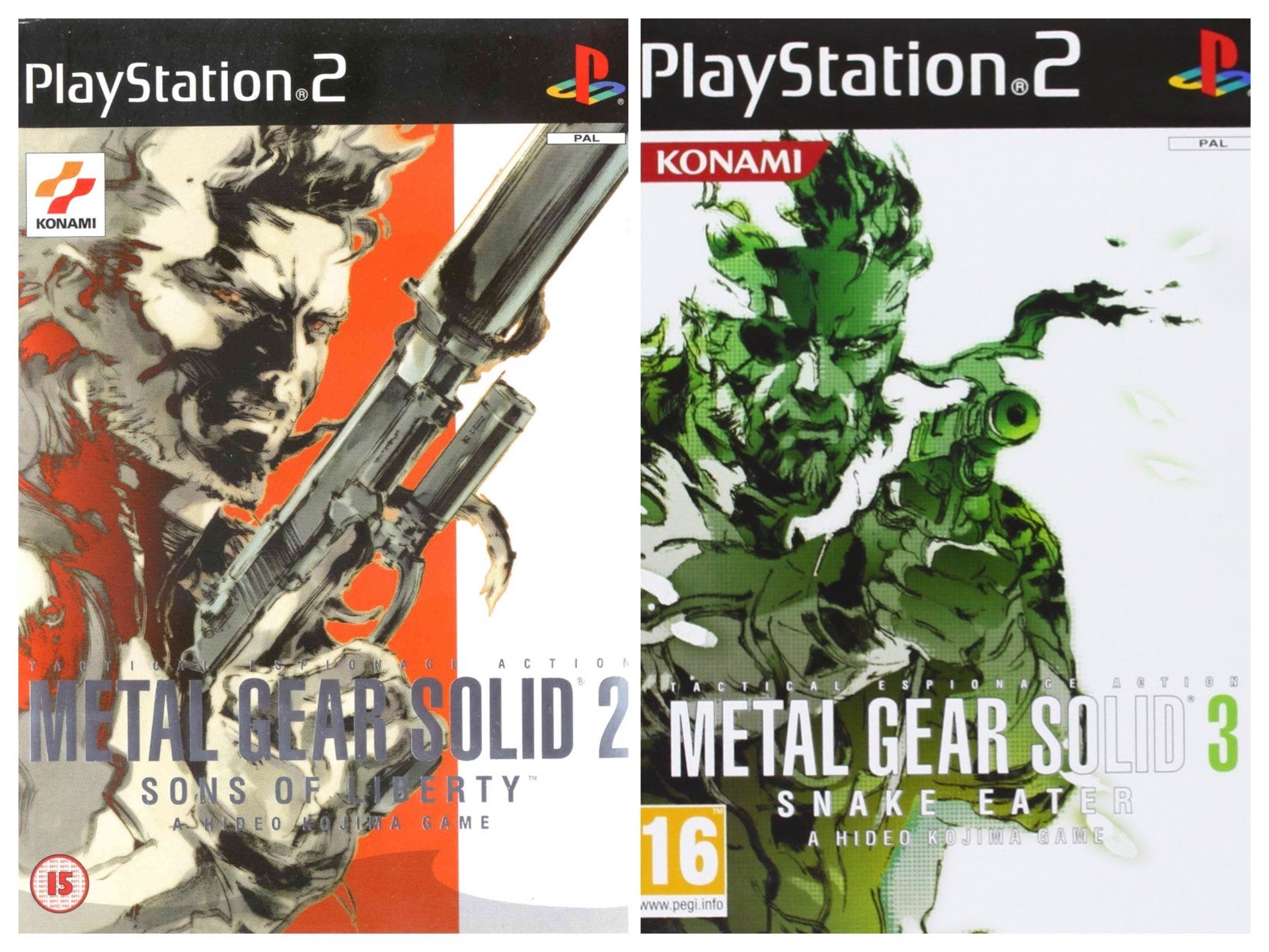
Almost inevitably, Shinkawa's strong art adorned the box of Metal Gear Solid, as it would for many other installments of the popular game series. Contrary to the industry norm of using "finished" cover art, Shinkawa chose to represent the game by loosely sketching out a leading character in inks, executed with brushy calligraphy pencils, and supporting the black-on-white sketch with a single support color.

These drawings stood out on store shelves, the flowy and somewhat nervous-looking black pen strokes suggestive of the tension in the game. Strong and immediately recognizable, "Shinkawa-style" illustration would be a hallmark of great game box art, and a lasting testament to the fabulous artistry of the hand that steered the calligraphy pen.
MGS07
© Konami

Yoji Shinkawa's box art for Metal Gear Solid 2 and 3. Note the brushy linework, and sparse coloring.

7. Stephen Bliss' work on Grand Theft Auto box art


Grand Theft Auto's trademark box art style (a set of key elements from the game drawn in comic style spliced together, with the game logo in the foreground) today is so ubiquitous, so well known, you easily forget the first two GTA games had very different box art.

The first had skyscrapers seen from an angle, in a fisheye perspective, and adorned with an entirely different GTA logo, and the second had a "snipers' view" of a yellow cab being hijacked as cover material. And a London 1969 mission pack had a simple Union Jack for a cover.

It fell to Senior Artist Stephen Bliss to find a look that would stand out on store shelves more. Bliss was known for his illustrative art, album cover art (Massive Attack's No Protection album sleeve is his design) and comics, giving him a broad and strong skillset to try and match the box cover art to the over-the-top cartoon quality of the game. His "montage" solution worked miracles and would be the standard for all GTA games, as well as other promotional arts for the ever-expanding franchise.
GTA
© Rockstar

Stephen Bliss' designs for Grand Theft Auto III and Grand Theft Auto Vice City, the games that launched Bliss' box designs in comic style.

Collector's choice

Browse collectors' favourite video game art prints!